10The Old Main Public LibraryCincinnati
Imagine that you stuck J.K. Rowling in a room full of Victorian steampunk enthusiasts and asked them to come up with a sketch for a magical library. You might just get the Old Main Public Library in Cincinnati. Built in 1874 for the oddly precise figure of $383,594.53 (around $7 million in 2014), it was designed to be “the most magnificent public library in the country.” Everything about it was like a nerdy booklover’s dream. Around 300,000 books sat stacked on shelves that stretched impossibly far into the air. Wrought iron spiral staircases led visitors up into shadowy realms where you could find books on anything and everything. Vast pillars supported balconies that teetered so far above the main hall that it was like standing in another world. Close your eyes and picture the Library of Alexandria transported into the 19th century. That was the old Public Library. Then in 1955, city authorities apparently decided there was just too much darn magic in Cincinnati already and ordered the library demolished. The building was sold off for $100,000, and America’s answer to Hogwarts Library was pulled to the ground.
9Great ConservatoryChatsworth
In the mid-19th century, Victorian Britain was seized by a mania for grandiose construction projects. Perhaps most grandiose of all were those designed by Joseph Paxton. A former gardener who crossed over into architecture, Paxton had a vision for a UK that was covered in vast glass temples. The first of these to go up was his Great Conservatory at Chatsworth for the Duke of Devonshire. A gigantic glass greenhouse held together by a wrought iron frame, the conservatory was like something out of an early sci-fi novel. A vast array of brilliantly colored plants and lush trees were crammed around a central thoroughfare big enough for two horse-drawn carriages to pass through. Amid the foliage, hidden ladders let visitors climb high into the treetops. Beneath the floor, eight boilers pumped scalding water around an 11-kilometer (7 mi) network of pipes, powered by coal brought in on a private underground railway. Started in 1836, it took four years to build. Unfortunately for posterity, it also cost an insane amount to heat. By the time World War I hit, the family was fed up with it and had the conservatory dynamited. Luckily, Paxton had followed up the Great Conservatory a decade later with the grander Crystal Palace. Unluckily, that structure burned to the ground in 1936.
8The Imperial HotelTokyo
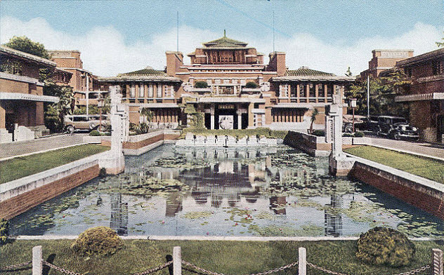
Built in 1923, the Imperial Hotel in Tokyo was everything you’d imagine a glamorous, prewar Japanese hotel to be. Designed by famed architect Frank Lloyd Wright, the complex was large, low-lying, and utterly beautiful. A palatial entrance stood at the head of a central pool, surrounded by a cacophony of Maya-inspired motifs. The plush interior was even grander. Even God Himself seemed to love Wright’s hotel. When the apocalyptic Great Kanto Earthquake flattened Tokyo and killed 140,000 people on the same day that the Imperial opened, the hotel was one of the few buildings to survive. When the Allies firebombed Tokyo in 1945, killing up to 130,000 and turning most of the city into ash, the Imperial once again emerged unscathed. However, there was one ordeal it couldn’t survive: safety regulations. When Wright first built the Imperial, he gave it a shallow foundation on loose, wet soil, so it would “float” on the mud if an earthquake ever struck. By 1968, the Japanese government had an official guide for building earthquake-proof buildings, and Wright’s designs didn’t make the cut. The building came down, and a bland high-rise structure was thrown up in its place.
7Mummers TheaterOklahoma City
When you say the words “modern architecture” to most people, they’ll immediately picture a great big concrete box. But the Mummers Theater in Oklahoma City was different. Built by John M. Johansen in 1970, it took the basic ideas of modernism and reshaped them into something unique. A series of gigantic, interlocking, brightly colored containers, the Mummers Theater was less a simple building than a sprawling complex. Inspired by the ideas of the then-dawning electronics age, the building was split up into dozens of separate components joined by walkways, tubes, and tunnels. In practical terms, this meant walking through the building was like taking a stroll through an alien city. The design was so utterly unique that it was made eligible for the National Register for Historic Places before it even turned 50. Then in 2010, torrential floods left the building with severe water damage. Rather than preserve it, the city chose to tear the place down. What did they elect to build in its place? A big, boring glass tower.
6The Domino Sugar RefineryNew York City
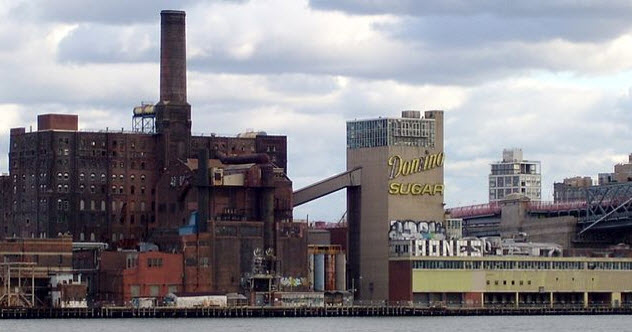
Built on the site of its burned-out predecessor in 1882, the Domino Sugar Refinery on New York City’s East River was once one of the country’s greatest industrial buildings. A 10-story, red-brick behemoth, it dominated the landscape as an icon of urban design. More importantly, it also looked utterly awesome. A rusted collection of looming towers, coiling pipes, and decaying machinery, it was exactly the sort of place where you’d expect to see Batman punching the Joker into a vat of bubbling chemicals. Everything about the site was massive. Clocking in at a jaw-dropping 8,400 square meters (90,000 ft2), it was once the largest sugar refinery in the world. Over 4,000 workers toiled there in difficult conditions to produce half of America’s sugar—more than 1 million kilograms (3 million lb) a day. In World War I, there was a notorious explosion at the site that many people believed to be an act of German sabotage. Yet, despite its history and movie-worthy atmosphere, the refinery eventually went the way of everything else on this list. Shut down in 2004, it was held in stasis for 10 years as an abandoned monument. In 2014, demolition finally began, robbing NYC of one of its urban icons.
5Grand Country HousesEngland
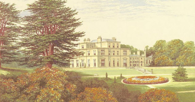
Although the era of upper-class privilege may have ended long ago, many of us still have a mental picture of England as something out of Downton Abbey. But if you go looking for these rural idylls, you’ll be in for a shock. As many as one-third of Britain’s country houses were blown up during the 20th century. Many of these houses were the sorts of buildings that most countries would kill to own. St. Leonard’s Hill in Berkshire looked like something out of a fairy tale. Others, like Eden Hall in Cumbria, were the sort of place you could imagine Evelyn Waugh writing about. Grand estates, literal castles, country mansions, and others are all now lost to history. According to Lost Heritage, nearly 2,000 grand buildings of the 17th, 18th, and 19th centuries were lost during this period. There are plenty of reasons for this, but they can probably be summed up in three simple phrases: death duties, lax conservation laws, and the Luftwaffe. In the immediate period after World War II, death duties were jacked up so high that many preferred to abandon their stately homes altogether, leaving the government to demolish them. The houses were also subject to few planning regulations until the late 1970s, meaning that plenty of wealthy people would inherit a house and then sell it to developers. Whatever the reasons, Britain’s architectural heritage suffered mightily.
4Prentice Women’s HospitalChicago
Some loved it. Others loathed it with a burning passion. Wherever you stand on the ideological divide, you can probably agree that Prentice Women’s Hospital in Chicago was unique. One of the many brutalist designs that swept America in the latter half of the 20th century, it looked like a concrete spaceship about to make a break for outer space. Built in 1975 by genius architect Bertrand Goldberg, the hospital was almost stupidly ahead of its time. Cutting-edge techniques borrowed from the aeronautics industry allowed the clover-shaped, concrete towers to seemingly float free without the need for supporting pillars. Ideologically, the hospital was ahead of the curve, too. Goldberg’s whole thing was to bring humanist concerns into brutalism’s uncompromising aesthetic. The curved design of the tower was meant to encourage chance encounters between patients. It also meant that every department was equidistant from the nurses’ station, a revolutionary idea for patient care in the 1970s. None of these facts could save the hospital when crunch time came. In 2013, Northwestern University had it demolished. In its place, the world got yet another glass tower.
3The Morris A. Mechanic TheatreBaltimore
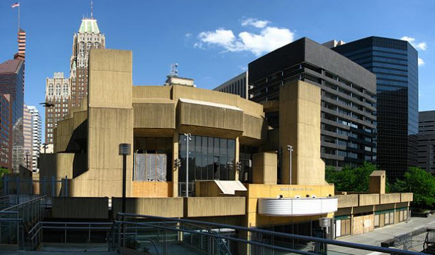
Poor John M. Johansen. The only architect to be featured twice on this list, the former pioneer of brutalism spent decades constructing weird, distinctive buildings across America, only to see some of them demolished. After Oklahoma City pulled down his Mummers Theater, you’d think that Baltimore could have left his (awesomely named) Morris A. Mechanic Theatre standing. No such luck. Built in 1967, the concrete theater was either an icon of American architecture or a god-awful eyesore. Looking like a crab peeking out from behind a rock, it didn’t fit in with the surrounding area at all. Yet that’s exactly why people loved it. When the theater opened, The Washington Post hailed it as an antidote to the “excessively slick” buildings surrounding it. The first night it opened its doors, nearly 2,000 people attended. Most importantly, the theater was built as a civic space, a place the whole city could appreciate. Unfortunately, the building’s weird exterior probably sealed its doom. In 2013, the city set about tearing the thing down, despite pleas for clemency by an ailing nonagenarian Johansen before his death in 2012. Want to guess what replaced it? A generic retail park.
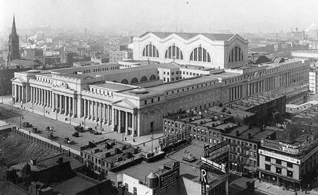
2The Original Penn StationNew York City
Between 1910 and 1963, New York City was home to one of the grandest monuments on Earth. Modeled on the Roman Baths of Caracalla and featuring 45-meter-high (150 ft) windows over a “sun-drenched” central chamber, vaulted corridors that seemed to go on forever, and vast platforms that could rival those of Victorian London, Penn Station was simply beautiful. It’s almost impossible for words to do the building justice. Thick, ancient-style columns held up a ceiling that was intricately carved with remarkable geometric shapes. Sweeping staircases led up into a warren of steel-and-iron walkways before plunging back onto the platforms. It was the biggest open indoor space in central New York. Art historian Hilary Ballon would later state: “Penn Station did not make you feel comfortable; it made you feel important.” For those readers who know what Penn Station looks like today, the idea that it was ever anything but a crawling hellhole might come as a shock. To paraphrase Vincent Scully, professor emeritus of architecture at Yale University, it used to be that heading into NYC via Penn Station made you feel like a god. Nowadays, it makes you feel like a trapped rat.
1Euston ArchLondon
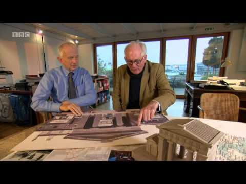
It was once the grandest entrance to any railway station on Earth. Built in 1837, the grand arch outside Euston station in London gave visitors the sort of welcome you’d expect as a time traveler to ancient Greece. When it was first constructed, Euston was the only metropolitan railway terminus in the world. By 1960, it was one of thousands across the globe. Then, in 1961, the Conservative government decided to knock down the historic arch against the wishes of the entire country. They replaced it with the dullest building imaginable. The vandalism didn’t stop there. After blowing up the 124-year-old arch, the architect removed some of the stones to build his own house in the suburbs. Unbelievably, the rest were thrown into the Prescott Channel to fill up a hole. Although up to half of the stones are believed to have survived, rescuing them now would be practically impossible in many cases. Still, as the BBC reports in the video above, there are plans under development to reconstruct the arch. Whether it will happen is anyone’s guess. Until then, we have the grandest station designed in history, and the first to boot, and it was deliberately blown up. Nice work, everyone.


